Don't turn off target !!

This has to be the most useless and scary software update screens to date that I've seen.
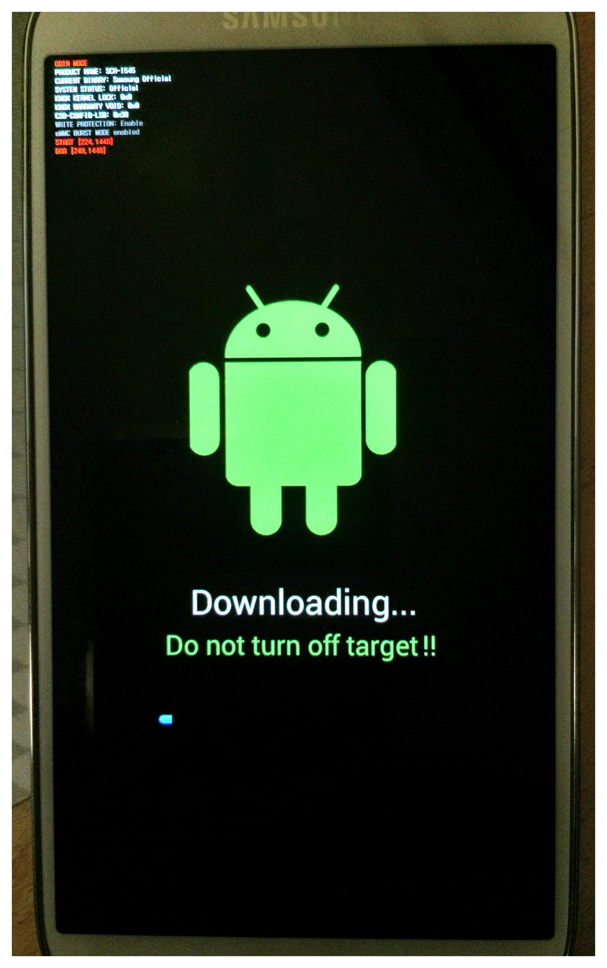
Don't get me wrong, I like Android and I'm getting back into developing software for it and iOS isn't blameless in the shit-UX department. I couldn't pass up this example of a super important interaction that is done so poorly.
Even though I'm familiar enough to what a "target" is in this context, I'm still confused by the screen. I'm uploading TO the device, not downloading FROM the device. According to this warning, I'm safe to turn off my computer and unplug the USB. The block of text in the upper left, while useful to a developer, is super scary for a user. If they're lucky to be blessed with 20/20 vision it's still pretty useless information.
The space between target and the exclamation points also makes me believe a careless developer wrote the UI. This results in me trusting this software update even less. If a semi-QA-type person couldn't pick this out right away then I'm really concerned about my phone getting bricked.
The moral of the story is - convey exactly what should and shouldn't happen when you're performing any critical operations. You're making your users feel very vulnerable and even if everything goes okay they may choose to not do the same action next time. Aim for happy fuzzies.